Image 6
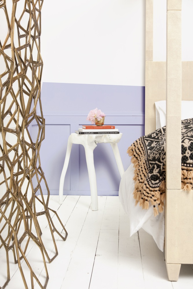
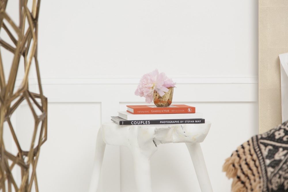
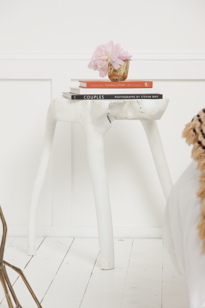
What the heck is it? I’m drawn to the color pink. I LOVE pink. I think. I love seeing pink tufted velvet couches, rich pink vintage satin curtains against baroque wallpaper in old movies. I love pink hair, pink cheeks, pink cotton candy and pink lipstick (although I don’t wear it).

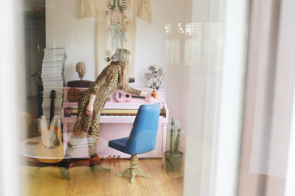
I started #mypinkkick on instagram because I realized I was obsessed with taking pictures of pink things and posting them.It makes me happy. I have a pink jumpsuit that you’ll spot for miles.  It’s SO loud. And a very large pink ball skirt that I love to wear with t-shirts around the house when I’m getting inspired.

But, for whatever reason, when I personally try to execute pink in my home or a design, I cannot seem to execute it where I can also live with it. AND Ugh! It really frustrates me.

I mainly get frustrated because, I dream up the pink in my head. I see it. I like it. I get myself very excited and convinced. Then every time, I open the paint, I say, “Whoa. That’s pink.” Stewart, my husbands just laughs, because he doesn’t understand why I keep trying.

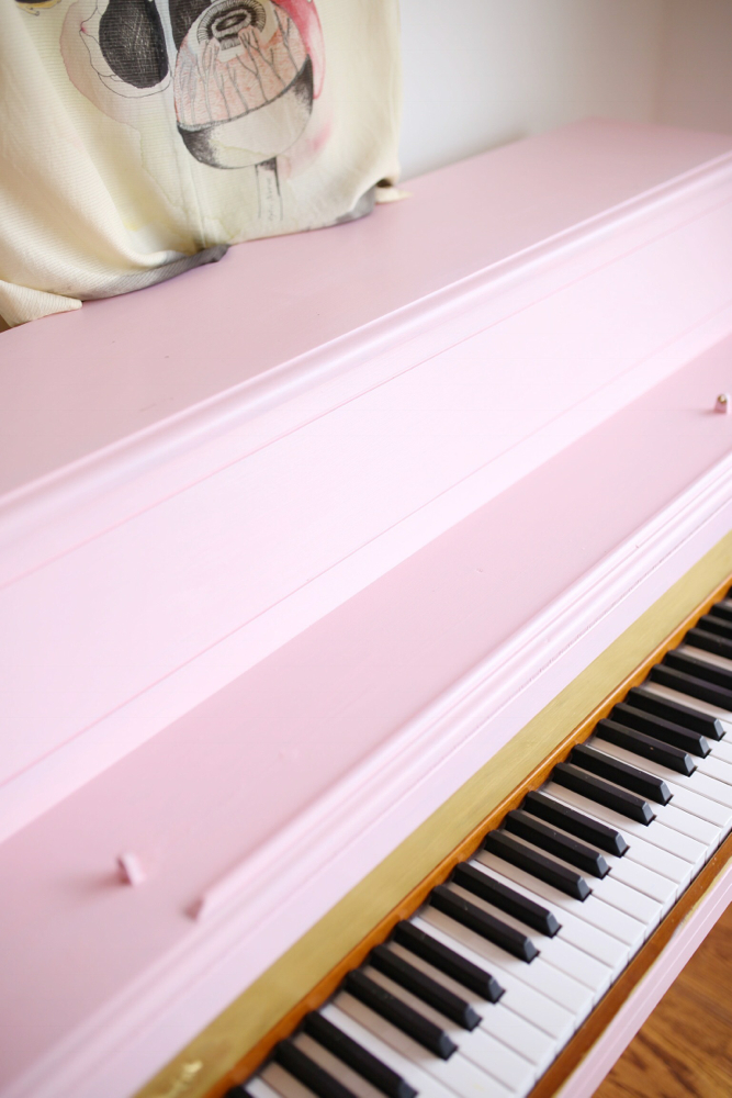
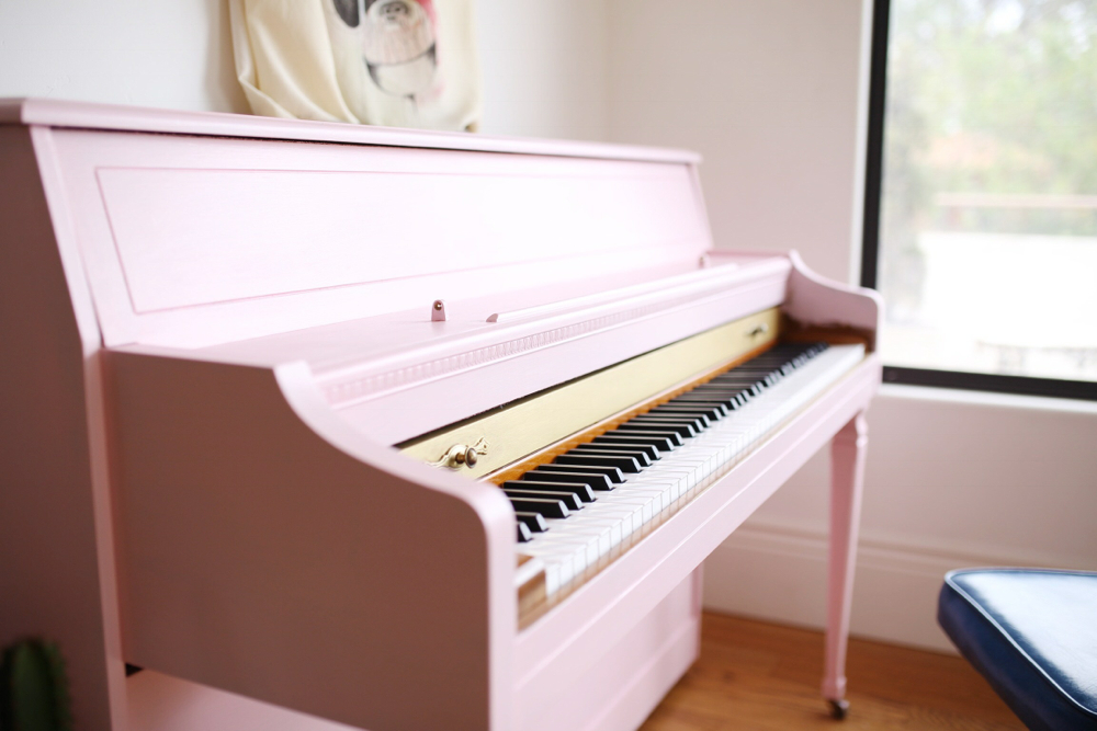
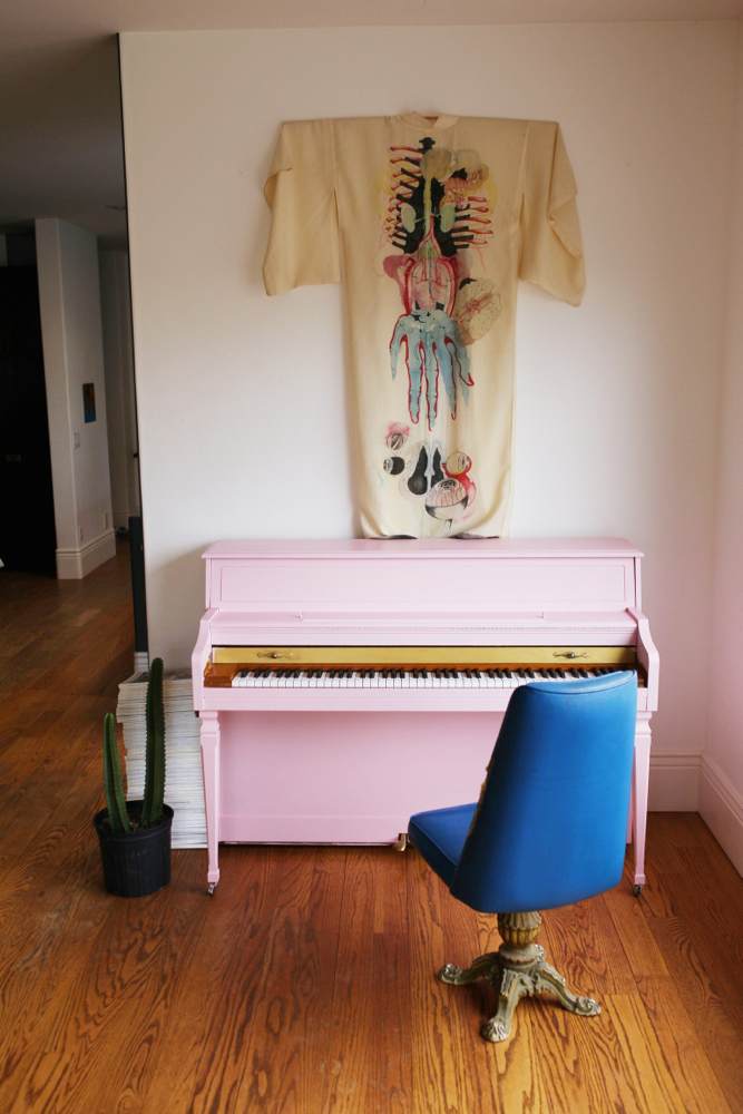
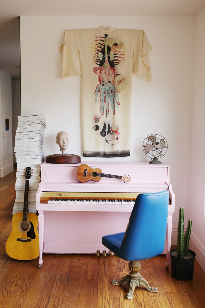
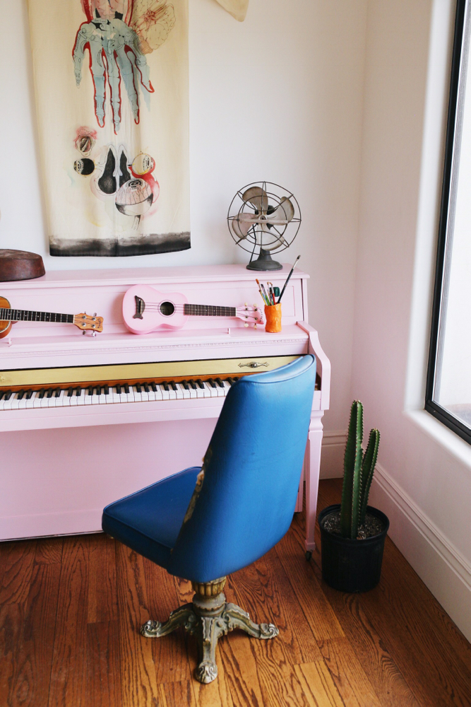
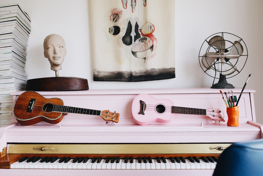
Anyway, this time, I channeled my deepest inner Elton John and painted my piano pink. Well that was fun, because I hate it. Well maybe hate is a little strong. I think it’s fun but I seriously can’t handle it in my room. I posted pictures of us styling it here anyway for those of you who love looking at pink. But rest assure, I painting it again.

My design definitely lends to the masculine side. I love vintage elegance and always work feminine pieces in to balance this. Pink just seems to throw it way over the edge. For me.

It’s a pinktastrophe, me and pink. I can’t live with it. I can’t live without it. Or maybe???…it’s the wrong color pink? 😉

xo
Smid

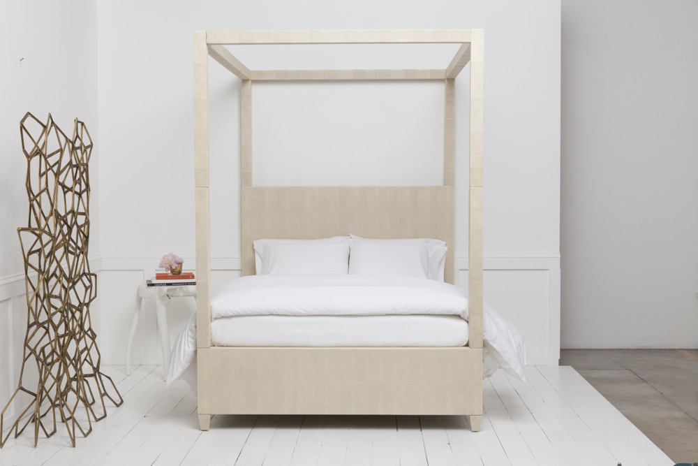
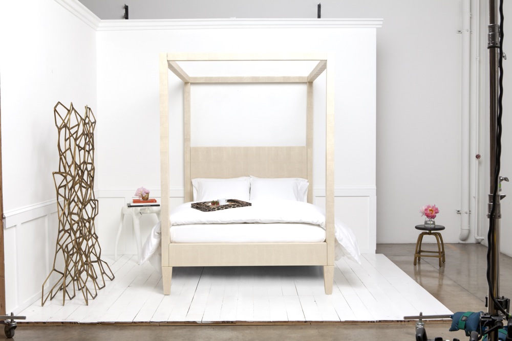
All Photos by Nicole Moser

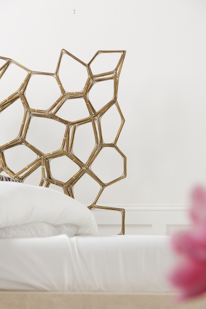
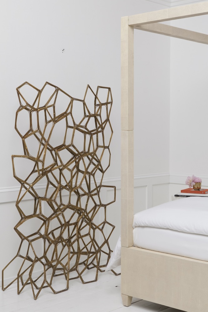
Art work by Selby Ginn

Image 1ImageImage 3 Image 5 Image 7 Image 6 Image 10Image 4


I am honored that Smid was asked to style the Made Goods furniture & decor catalogue this year. I was really excited about this project and also nervous. Sometimes when you are asked to style another company’s furniture and/or are given the product to work with rather than hand selecting the pieces for design, it can be challenging to make look good. This wasn’t the case with Made Goods.  They have really amazing pieces. We were able choose what was placed together out of their new line. Some of their line, however, can feel really strong from a design standpoint. It’s my favorite thing about this company. I like to think of those pieces more like art. We wanted to give all of their products the show time but also make sure the featured pieces balanced each other out so as not to outshine one another or make the room feel overpowered. The tone on tone play with white helped us achieve this in the bedroom. I love how it turned out. What do you think?

Photos by Yudi Echevarria
Art Directed by National Forest
Styled by Smid
Design Assistant, Hillary Bell


Xo, Smid

_MG_6097

Moroccan blanket appearance from  Pow Wow Design Studio

_MG_6097_purple

We tried purple. Although fun, it confirmed our thinking.

MadeGoods_Styled_Day1_368

Breakin’ it down.

MadeGoods_Styled_Day1_374

MadeGoods_Styled_Day1_378


_MG_6116

I’ll let you in on a little secret. Nobody’s bed gets that fluffed without a little help. Do you see what I see? There is plastic bubble under there. 🙂

MadeGoods_Styled_Day1_384

MadeGoods_Styled_Day1_392

MadeGoods_Styled_Day1_389

_MG_6100

_MG_6099


Recently, I have been on a pretty intense mission to find beautiful throw rugs for clients. I wanted to find unique pieces with more depth or character than what you typically see in a store.  In the past, personally, I have tended to lean toward the heavy classic faded oriental or a basic hide simply because of their clean lines, lower profile and yet dramatic feel. The flea market, specifically the Long Beach Flea and Pasadena’s Rose Bowl have opened my eyes to an entire new world of amazing jaw dropping rugs.

-Smid

IMG_0016

Vendor Unknown